Do you use Gmail? Do you access your Gmail account using Safari, Google Chrome or another web browser on your Mac? Do you like Gmail’s look and feel? I don’t like Gmail’s interface at all. Fortunately, Google lets you customize Gmail’s interface extensively. Here’s a list of the changes I made to make Gmail easier to use, at least from my point of view.
You may not like all of the changes that I’ve chosen to make but you might find one or two that appear to you.
Change Themes
- Click on the gear icon that appears on the right-hand side of your Gmail window and select Themes.
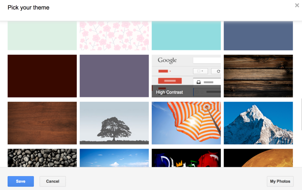
- Scroll through the gallery of themes, click on the one named High Contrast and then click the Save button which appears in the lower left corner. Use the image below as a guide. [Please note that theme names only appear when you hover your cursor over them. Gmail’s default theme is named Light.]
Change Display Density
- Click on the gear icon that appears on the right-hand side of your Gmail window and select Compact which is listed under Display Density. The default Display Density is Comfortable which has the most white space between various interface elements. Comcast has the least amount of white space.
Turn Off Conversation View
- Click on the gear icon that appears on the right-hand side of your Gmail window and select Settings.
- Click on the General category.
- Locate the Conversation View section and select Conversation view off. By turning off this feature, each email message will appear separately, rather than grouping related messages.
- Scroll to the bottom and select Save Changes.
Enable Preview Pane
- Click on the gear icon that appears on the right-hand side of your Gmail window and select Settings.
- Click on Lab category.
- Scroll down to Preview Pane and select Enable

- Scroll to the bottom and select Save Changes
- You’ll be automatically taken back to your Gmail Inbox.
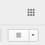
- Locate the new button that appears that looks like 4 horizontal lines
- Click this button and select Vertical Split
I hope you find Gmail’s interface a bit more friendly and usable after making some of these changes.


